

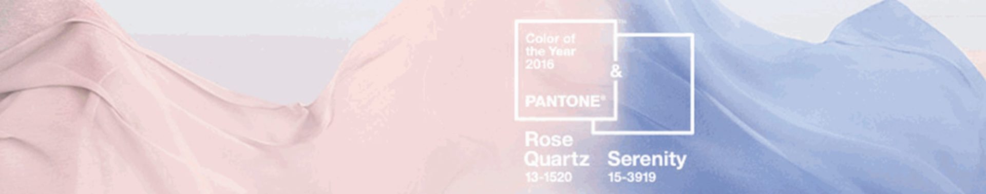
With all the chaos going on in the world nowadays, it’s no wonder why, for the first time ever, color authority Pantone® chose two colors to represent 2016, Rose Quartz and Serenity.
 Serenity. Think the calm skyline when the sun is going down and the transition of color from blue to orange to pink (rose quartz) to yellow. After all, by definition the word means “the state of being calm, peaceful, and untroubled.” When I heard of the chosen colors for 2016, I thought about a picture I had snapped at the University of Louisiana Lafayette a couple of months ago. While walking to my night class, I stopped and looked at the horizon to see this peaceful blended dusk. “Serenity is weightless and airy, like the expanse of the blue sky above us, bringing feelings of respite and relaxation even in turbulent times.” – Pantone Serenity, with its soft baby blues evokes calmness and peacefulness. Much in the same way nature does through the sky, oceans, and rivers. And generally, blue is a universally popular color. In my experience, blue makes me feel at peace, happy.
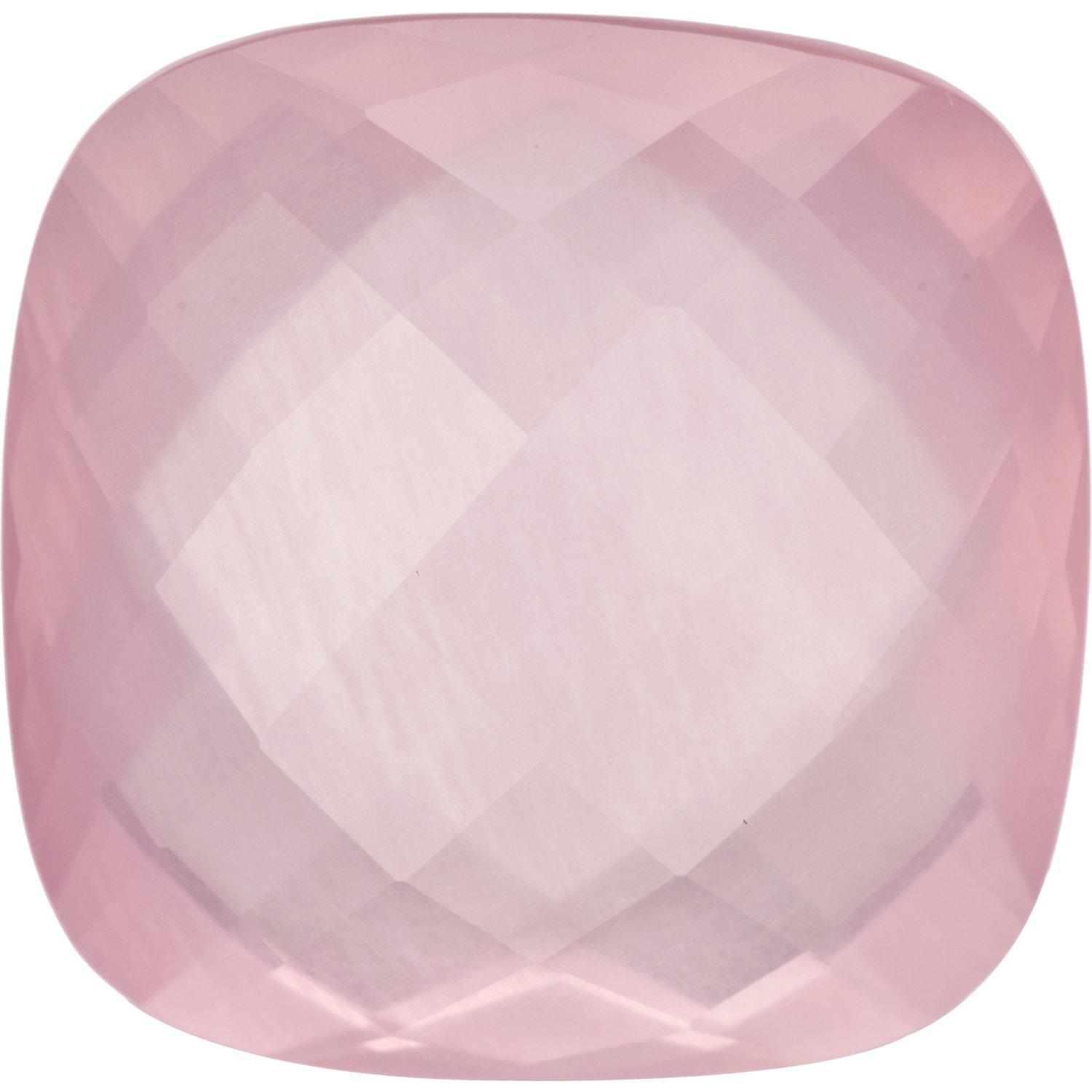
Rose Quartz. A playful, pinky hue. The experts say that rose quartz is “a persuasive yet gentle tone that conveys compassion and a sense of composure.” But don’t underestimate this color. According to Pantone’s Executive Director, Leatrice Eiseman, “Rose Quartz is not baby pink. It doesn’t have that wimpy feel.”
While many folks feel like the colors invoke thoughts of conventional baby colors, that’s not the case. Instead Pantone aimed to challenge “traditional perceptions of color association” with the pairing. These pastel colors, when put together, blend very well, and you already see them everywhere around you! Rose quartz, a soft, delicate, tranquil shade along with the baby blue Serenity brings wellness, balance, and calmness to the world.
 |
 |
 |
In the coming year, expect these colors to be everywhere: from runway fashion, to appliances, to paint colors. You name it, they’ll be there, so be prepared to incorporate these colors in your store one way or another.
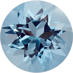
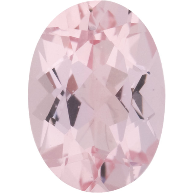
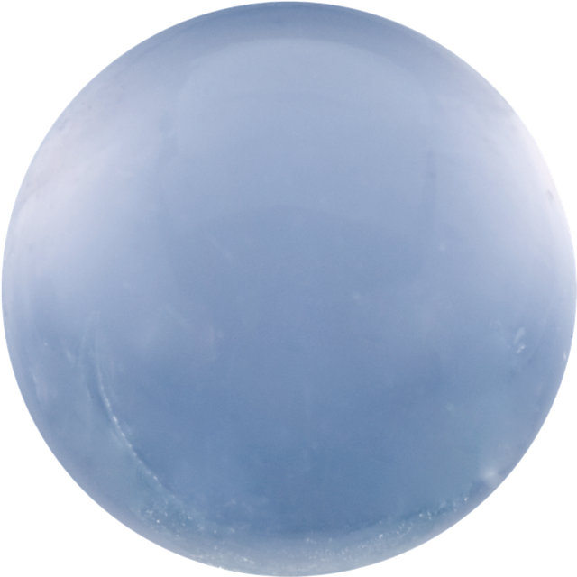
Some gemstone options could include:
|
|
|
|
|
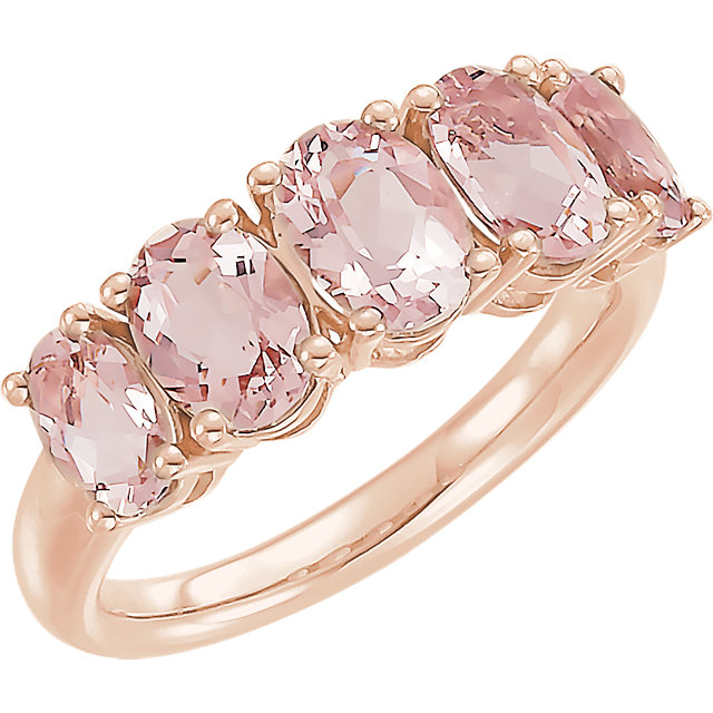
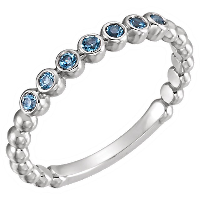
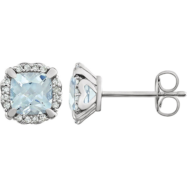
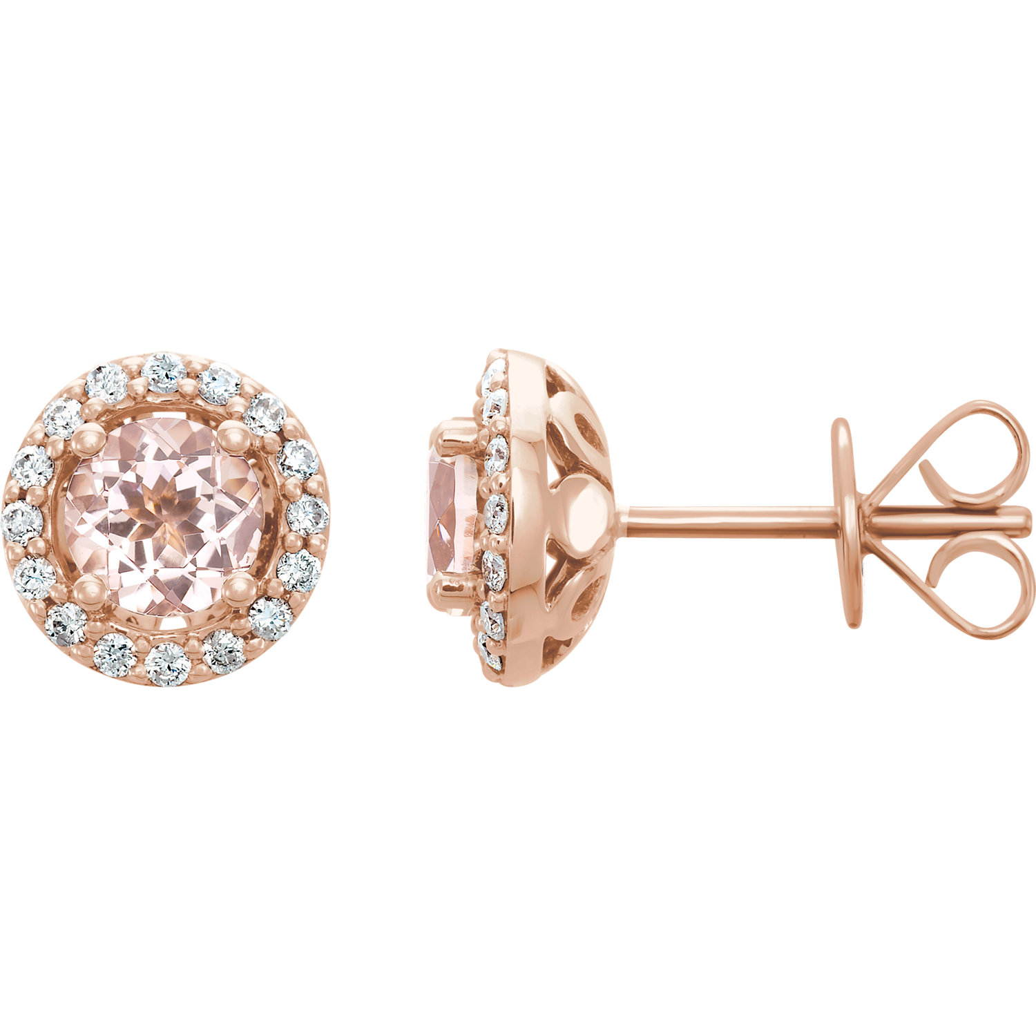
Take a look at the pieces below and get inspired:
|
|
|
|
|
Do you have a favorite between these two colors? Do you already have any of these colors in your store? Share your thoughts in the comments section below.
